Understanding Colour
Learning goals
- I can describe colour using hue, saturation, and value.
- I can explain the difference between RGB screens and CMYK printing.
- I can explain how opacity changes the result.
The lesson uses the BBC guidance for visually and hearing impaired audiences as its accessibility reference and keeps only the diagrams needed to explain each decision.
Why this is useful
Colour is easier to control when you separate what kind of colour it is from how intense and how light it is. The same model helps with screens, print, paint, and accessibility checks.
How the eye receives colour information
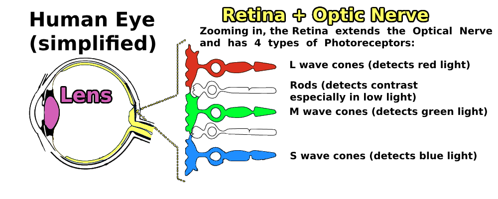
Four receptor types
The guide simplifies the retina into three kinds of cone cells for colour and rod cells that are especially useful in low light.
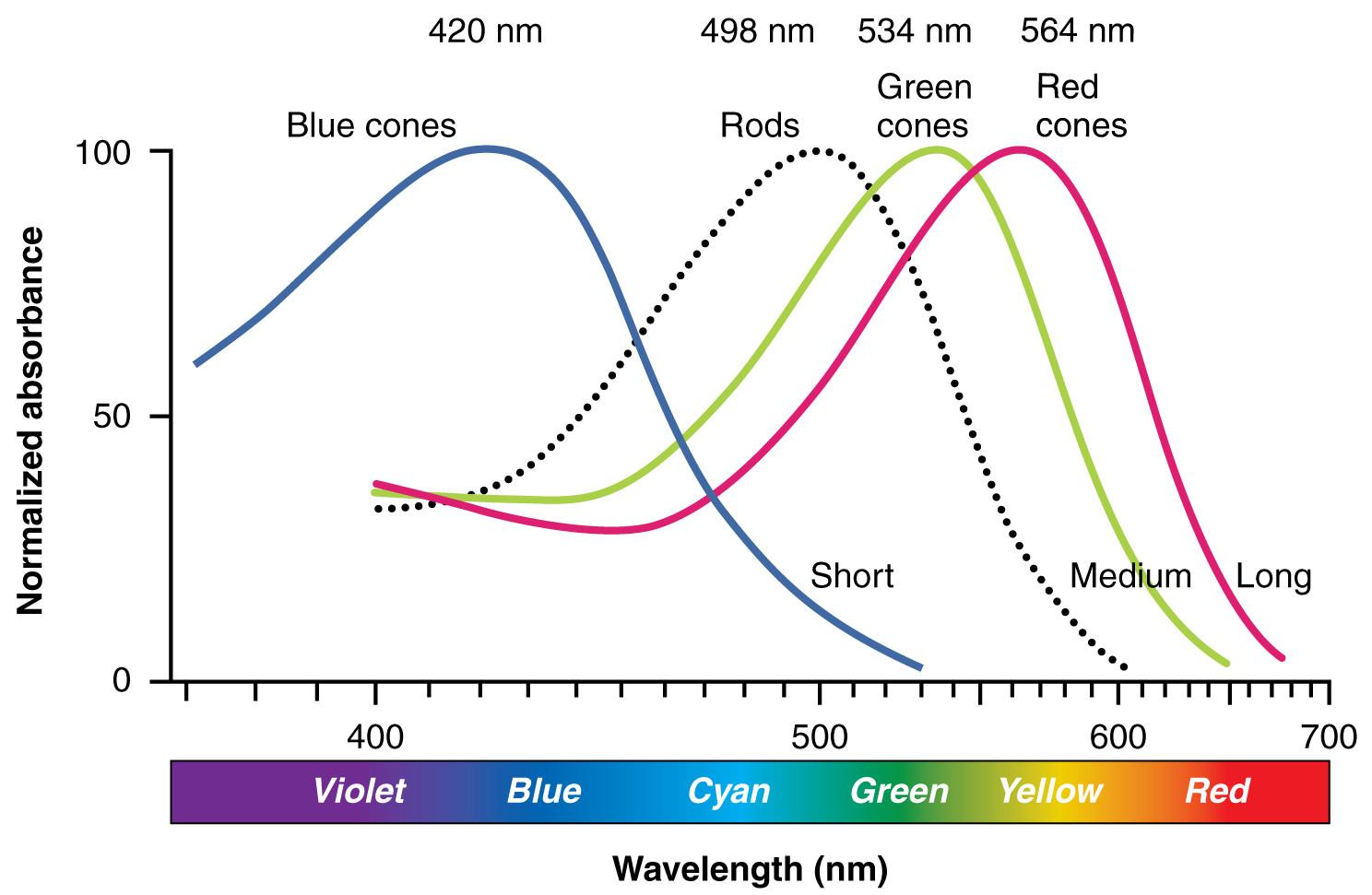
Overlapping responses
The curves overlap. The brain interprets a pattern of signals rather than receiving a single red, green, or blue value. Source noted in the guide.
Separate hue, saturation, and value
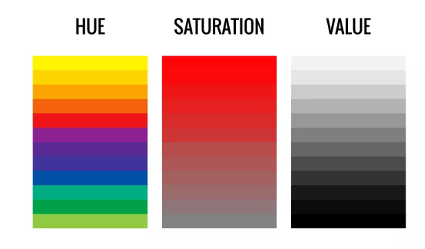
Hue, saturation, value
Hue identifies the colour family. Saturation describes intensity or greyness. Value describes lightness or darkness. Source.
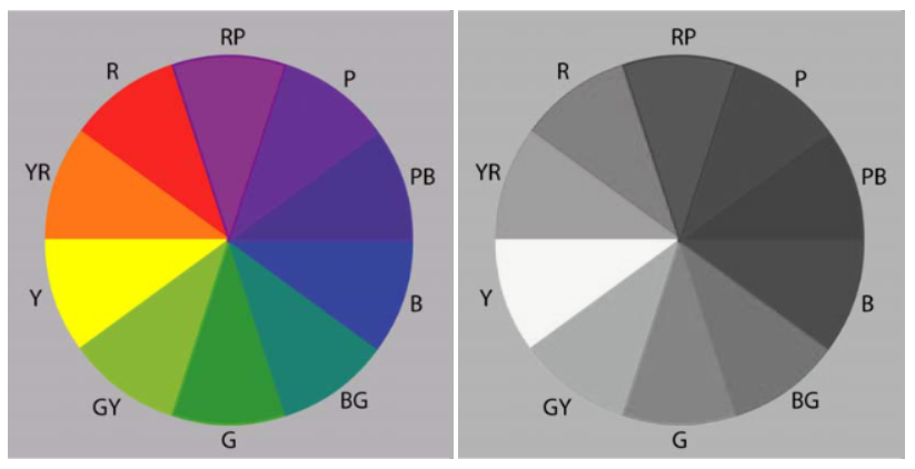
Different hue, similar value
Strongly different colours can have nearly the same lightness. This is why a monochrome check can reveal weak contrast. Source.
Connect the model to design software
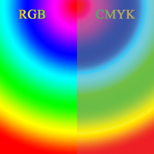
RGB screen, CMYK print
Screens mix emitted red, green, and blue light. Many printing systems use cyan, magenta, yellow, and black inks. A bright screen colour may reproduce with less intensity in print.
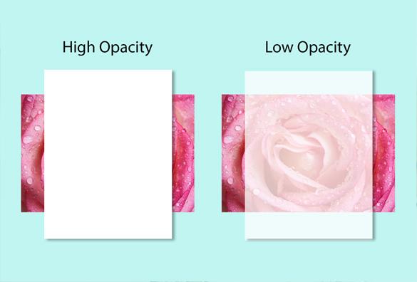
Opacity controls what shows through
High opacity blocks more of the layer below. Low opacity allows more of it to affect the result. Source noted in the guide.
Go deeper: the Munsell colour solid
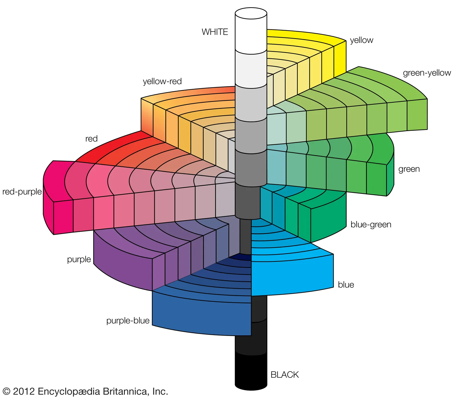
The Munsell system organizes colour in three dimensions: value moves vertically, hue moves around the centre, and chroma moves outward. Source: Encyclopaedia Britannica.
Try it
Choose one hue in your design tool.
- Make a vivid and a muted version by changing saturation.
- Make a light and a dark version by changing value.
- Convert the set to greyscale.
- Record which differences remain visible without hue.
Check your work
- You can name whether you changed hue, saturation, value, or opacity.
- Important colours still separate in greyscale.
- You previewed a screen design on the target screen or a print design in print.
- Opacity does not create an unpredictable background for text.
Summary
Hue tells you the colour family, saturation tells you its intensity, and value tells you its lightness. Value is the most direct bridge to readable contrast. Continue to Contrast, Emphasis & Output.