Fonts & Text Effects
Learning goals
- I can compare fonts at the size people will actually see.
- I can judge whether a background, outline, shadow, or 3D effect improves readability.
- I can keep style without letting effects hide the letter shapes.
The figures below support the BBC guidance for visually and hearing impaired audiences. They are kept beside the exact design decision they demonstrate.
Why this is useful
Type can look clear while you are zoomed in and fail at the actual size. Letter shape, spacing, line thickness, background, and output method all affect readability.
Start with clear letter shapes
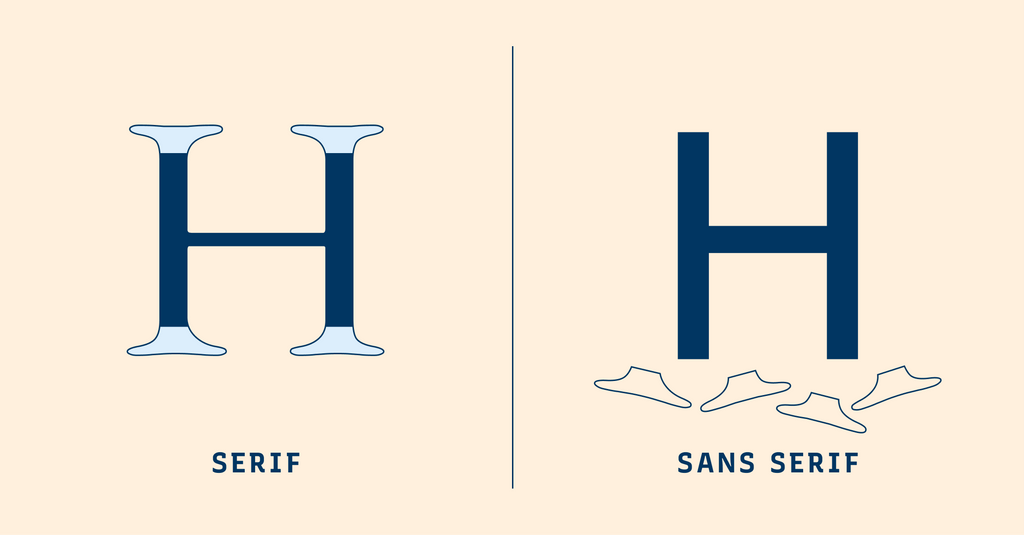
The guide uses this comparison to introduce serifs. Source: Typogram.
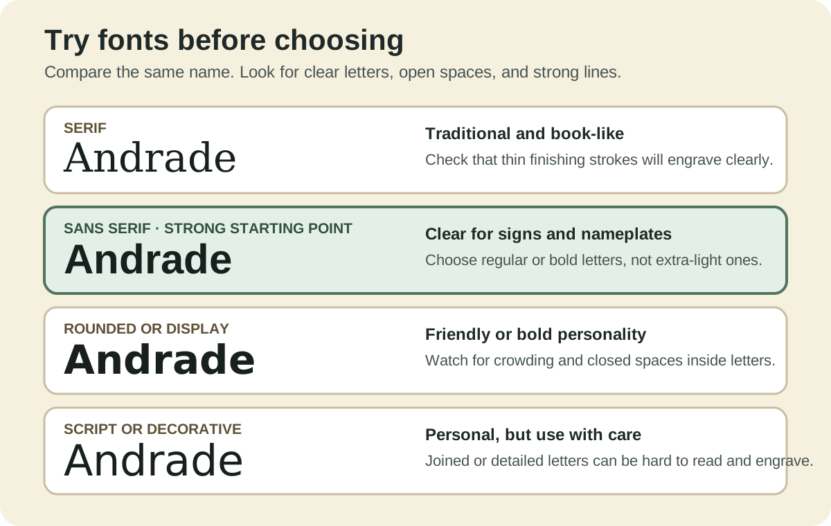
Sans serif is a useful starting point for small labels and screen text, but category alone does not make a font accessible. A familiar serif can outperform a thin, condensed, or decorative sans serif. Compare the actual letters at the actual size.
Look for:
- open spaces inside letters such as a, e, B, and 8;
- clear differences between I, l, 1, O, and 0;
- enough line thickness for the screen, printer, cutter, or engraver;
- comfortable spacing between letters, words, and lines;
- a size that still works after you step back.
Give text a reliable background
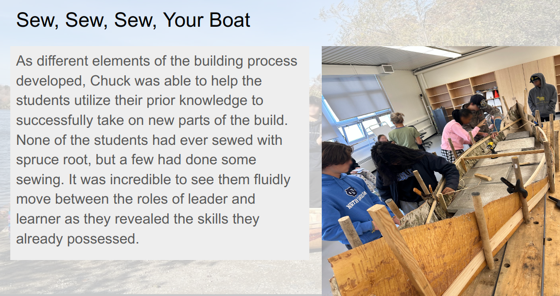
The solid panel keeps the paragraph readable even when the photograph changes behind it. Example retained from the original guide.
Text placed directly on a photograph has many backgrounds at once. A solid or nearly solid panel is the most dependable fix. A shadow or outline may help a short title, but it should not be asked to rescue a paragraph.
Compare effects by what they do to the letters
Outline with restraint
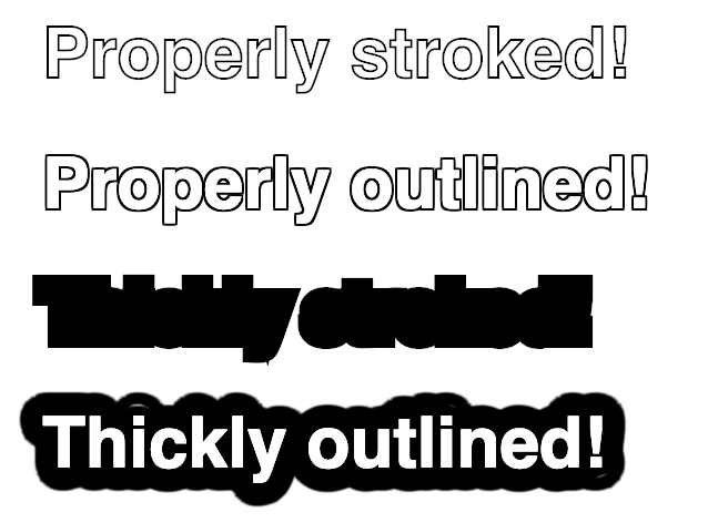
A thin halo can separate text from a changing background. Thick effects fill counters and merge neighbouring letters. Source example.
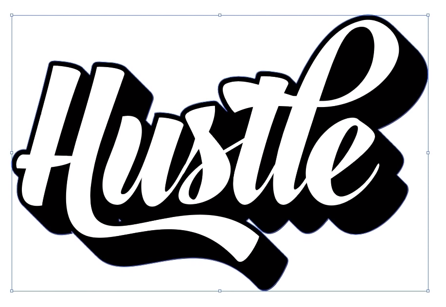
Shadow can separate
The outline and shadow add separation, but the script letter shapes still take longer to recognize. Style does not cancel the need to test.

Effects can compete
Depth, highlights, outlines, and internal strokes all compete with the letters. Use this treatment for display only, not instructions or small labels. Source video.
Try it
Set the same short word in three fonts. Keep the size and colour identical.
- View the words at 100%.
- Step back or reduce the design to its final output size.
- Compare the thinnest lines and the open spaces inside letters.
- Add one effect at a time. Keep it only if recognition becomes faster.
Check your work
- The type remains clear at the final size.
- Important text does not depend on a photograph staying light or dark.
- An outline does not close the spaces inside letters.
- A shadow separates text without becoming a second word.
- Decorative or 3D type is limited to short display text.
Summary
Choose the font by testing the real output, then add the least effect needed. Continue to Understanding Colour.