Contrast, Emphasis & Output
Learning goals
- I can use colour for emphasis without making colour the only cue.
- I can measure text and graphic contrast.
- I can test the final screen, print, or fabricated result and revise it.
The lesson applies the BBC guidance for visually and hearing impaired audiences. WCAG 2.2 ratios are added so students have a measurable test as well as a visual comparison.
Why this is useful
“Looks different” is not a reliable contrast test. Two colours can have different hues and still be almost the same lightness. Measure the pair, then test the real output.
Use a measurable minimum
Clear contrast
12.6:1 · comfortably above the minimum
Minimum contrast
4.5:1 · passes for normal-size text
Weak contrast
2.0:1 · fails for text and essential graphics
Large text, at least 24 px regular or about 18.5 px bold, can use 3:1. Essential icons, controls, and graphic boundaries also need 3:1. Do not round: 4.49:1 does not meet 4.5:1.
These are WCAG 2.2 Level AA thresholds for digital content. They are a starting point, not a promise that every person or output device will find the result easy to use. Aim higher when you can.
Compare the guide’s examples
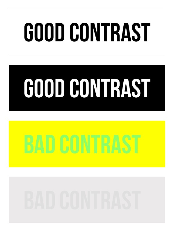
Light-dark difference matters
The top two pairs have a large value difference. The bottom pairs do not. Source noted in the guide.
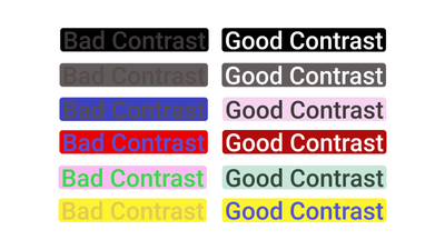
Hue is not enough
Changing the background value makes each word easier to separate, even when the hue remains similar. Source noted in the guide.
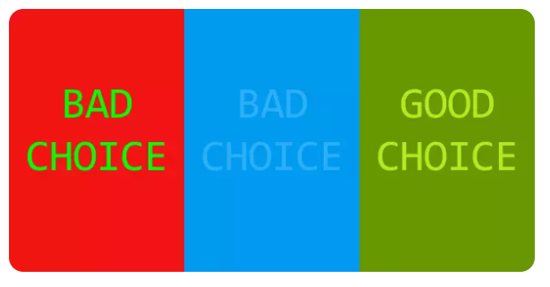
Some pairs interfere
Red-green and similar-blue pairs can fail for different reasons. The final pair adds a clear light-dark difference. Source noted in the guide.
Do not use colour alone
If colour communicates a status, category, warning, or selected state, add another cue.
Add a label
Write Pass and Revise, not just green and red dots.
Add a shape or pattern
Use different marker shapes, line styles, or fill patterns in a chart.
Add position
Keep categories in a stable order and label them directly.
Add emphasis
Use weight, size, an icon, or a border together with colour.
Test the real result
- Check the design at its final size, not only while zoomed in.
- Use a contrast checker for digital text and essential graphics.
- View a greyscale copy.
- Test on the target projector, printer, material, cutter, or engraver.
- Show it without explaining it. Ask what the person noticed first and what was difficult to understand.
- Revise and test again.
For fabrication, make a small sample before the final piece. Check thin lines, small gaps, inside spaces, surface finish, and lighting.
Check your work
- Normal-size text meets at least 4.5:1.
- Large text and essential non-text graphics meet at least 3:1.
- Colour is never the only signal.
- Text over a photograph has a dependable background or a tested halo.
- The real output has been checked from the expected viewing distance.
Summary
Measure contrast, add a second cue, and test the actual output. Return to the Accessible Design guide and use the four checks before publishing.
Sources: W3C Understanding Contrast Minimum, W3C Understanding Non-text Contrast, and W3C Understanding Use of Color.