Author: Mohamed (GitHub: 783009)
Date: 2025-10-07
You can veiw the Jupyter notebook file(.ipynb) here
You can veiw the pdf file here
This notebook performs a full exploratory data analysis (EDA) on Anscombe’s Quartet, highlighting the importance of visual inspection alongside summary statistics.
Anscombe’s Quartet consists of four datasets with nearly identical summary statistics (means, variances, correlations, and regression lines) but dramatically different distributions when graphed. This notebook demonstrates how summary statistics alone can be misleading and highlights the role of visualization in exploratory data analysis (EDA). Multiple plots, including scatter plots, regression lines, residuals, boxplots, and violin plots are presented, alongside interactive visualizations using Plotly and Altair.
# -------------------------------
# 1️⃣ Imports
# -------------------------------
import pandas as pd
import numpy as np
from scipy import stats
import matplotlib.pyplot as plt
import seaborn as sns

sns.set(style="whitegrid")
plt.rcParams['figure.figsize'] = (8, 6)

# -------------------------------
# 2️⃣ Load CSV (wide format)
# -------------------------------
df_wide = pd.read_csv("anscombe.csv")

# Rename columns for consistency
df_wide = df_wide.rename(columns={
    'x123': 'x1',
    'x4': 'x4',
    'y1': 'y1', 'y2': 'y2', 'y3': 'y3', 'y4': 'y4'
})

print("Wide-format data:")
display(df_wide.head())
Wide-format data:
| x1 | y1 | y2 | y3 | x4 | y4 | |
|---|---|---|---|---|---|---|
| 0 | 10.0 | 8.04 | 9.14 | 7.46 | 8.0 | 6.58 |
| 1 | 8.0 | 6.95 | 8.14 | 6.77 | 8.0 | 5.76 |
| 2 | 13.0 | 7.58 | 8.74 | 12.74 | 8.0 | 7.71 |
| 3 | 9.0 | 8.81 | 8.77 | 7.11 | 8.0 | 8.84 |
| 4 | 11.0 | 8.33 | 9.26 | 7.81 | 8.0 | 8.47 |
The dataset is loaded from anscombe.csv and initially in a wide format, with separate columns for each dataset’s X and Y values.
We convert it to a long format (dataset, x, y) to facilitate grouping and analysis.
# -------------------------------
# 3️⃣ Convert to long format
# -------------------------------
df_list = []
for i in range(1,5):
    x_col = 'x1' if i < 4 else 'x4'
    y_col = f'y{i}'
    temp = pd.DataFrame({
        'dataset': [f'Dataset {i}'] * len(df_wide),
        'x': df_wide[x_col],
        'y': df_wide[y_col]
    })
    df_list.append(temp)

df = pd.concat(df_list, ignore_index=True)

print("Long-format data:")
display(df.head())

# -------------------------------
# 4️⃣ Summary statistics
# -------------------------------
results = []
for dataset_name, group in df.groupby('dataset'):
    x = group['x']
    y = group['y']

    mean_x = np.mean(x)
    mean_y = np.mean(y)
    var_x = np.var(x, ddof=1)
    var_y = np.var(y, ddof=1)
    std_x = np.std(x, ddof=1)
    std_y = np.std(y, ddof=1)
    cov_xy = np.cov(x, y)[0, 1]
    corr = np.corrcoef(x, y)[0,1]

    slope, intercept, r_value, _, _ = stats.linregress(x, y)
    r_squared = r_value**2

    results.append({
        "Dataset": dataset_name,
        "Mean X": round(mean_x,2),
        "Mean Y": round(mean_y,2),
        "Var X": round(var_x,2),
        "Var Y": round(var_y,2),
        "Std X": round(std_x,2),
        "Std Y": round(std_y,2),
        "Cov XY": round(cov_xy,2),
        "Correlation": round(corr,2),
        "Slope": round(slope,2),
        "Intercept": round(intercept,2),
        "R²": round(r_squared,2)
    })

summary = pd.DataFrame(results)
print("\nSummary Statistics:")
display(summary)
Long-format data:
| dataset | x | y | |
|---|---|---|---|
| 0 | Dataset 1 | 10.0 | 8.04 |
| 1 | Dataset 1 | 8.0 | 6.95 |
| 2 | Dataset 1 | 13.0 | 7.58 |
| 3 | Dataset 1 | 9.0 | 8.81 |
| 4 | Dataset 1 | 11.0 | 8.33 |
Summary Statistics:
| Dataset | Mean X | Mean Y | Var X | Var Y | Std X | Std Y | Cov XY | Correlation | Slope | Intercept | R² | |
|---|---|---|---|---|---|---|---|---|---|---|---|---|
| 0 | Dataset 1 | 9.0 | 7.5 | 11.0 | 4.13 | 3.32 | 2.03 | 5.5 | 0.82 | 0.5 | 3.0 | 0.67 |
| 1 | Dataset 2 | 9.0 | 7.5 | 11.0 | 4.13 | 3.32 | 2.03 | 5.5 | 0.82 | 0.5 | 3.0 | 0.67 |
| 2 | Dataset 3 | 9.0 | 7.5 | 11.0 | 4.12 | 3.32 | 2.03 | 5.5 | 0.82 | 0.5 | 3.0 | 0.67 |
| 3 | Dataset 4 | 9.0 | 7.5 | 11.0 | 4.12 | 3.32 | 2.03 | 5.5 | 0.82 | 0.5 | 3.0 | 0.67 |
The following table summarizes each dataset’s key statistics:
These metrics demonstrate why the four datasets look similar numerically but can behave very differently when visualized.
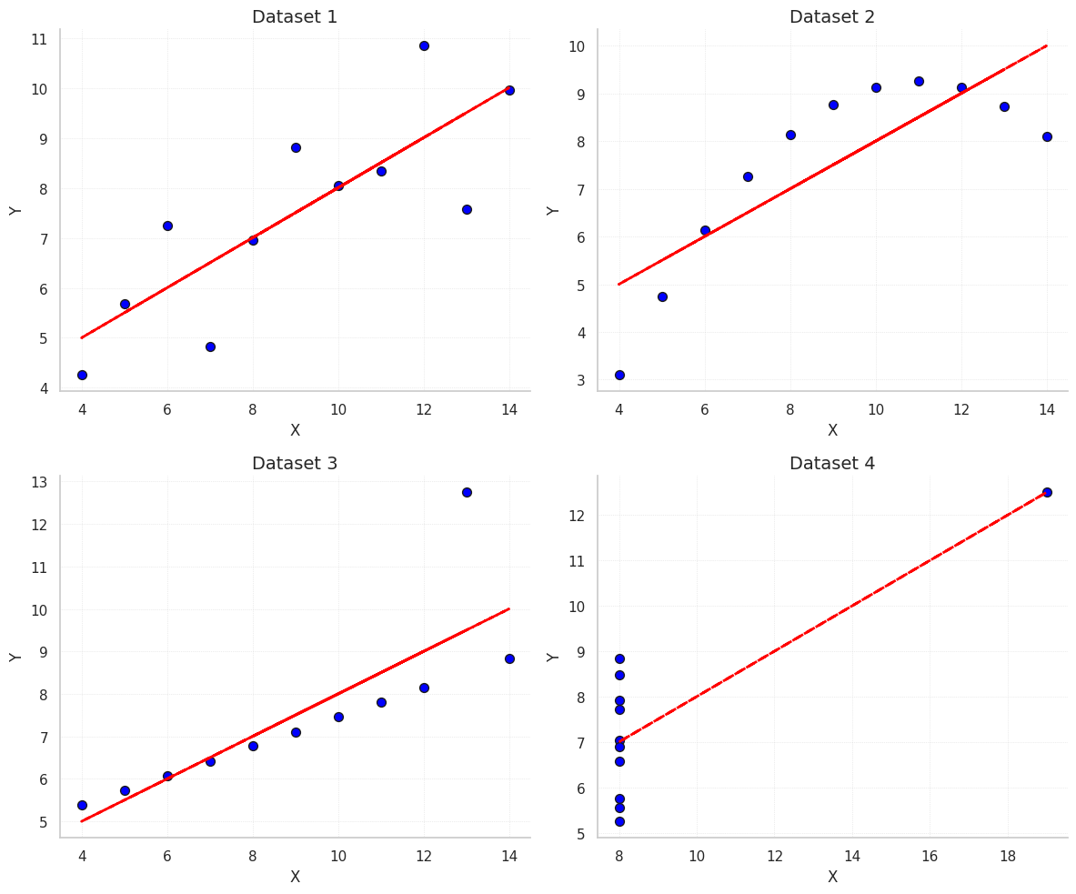
These scatter plots show the relationship between X and Y for each dataset along with the fitted ordinary least squares (OLS) regression line.
Observations:
# -------------------------------
# 5️⃣ Scatter plots + regression
# -------------------------------
fig, axes = plt.subplots(2, 2, figsize=(12,10))
axes = axes.flatten()

for i, (dataset_name, group) in enumerate(df.groupby('dataset')):
    x = group['x']
    y = group['y']

    # Scatter plot
    axes[i].scatter(x, y, color='blue', s=50, edgecolor='k')

    # Regression line
    slope, intercept, r_value, _, _ = stats.linregress(x, y)
    y_pred = slope * x + intercept
    axes[i].plot(x, y_pred, color='red', linestyle='--', linewidth=2)

    # Titles and labels
    axes[i].set_title(f"{dataset_name}", fontsize=14)
    axes[i].set_xlabel("X", fontsize=12)
    axes[i].set_ylabel("Y", fontsize=12)

    # Remove top/right spines
    axes[i].spines['top'].set_visible(False)
    axes[i].spines['right'].set_visible(False)

    axes[i].grid(True, linestyle=':', linewidth=0.5, alpha=0.7)

plt.tight_layout()
plt.show()
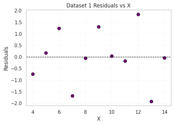
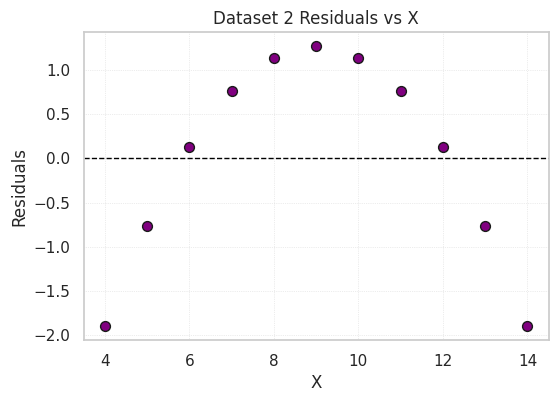
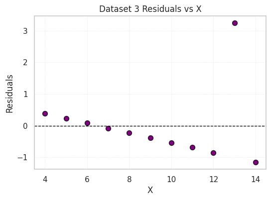
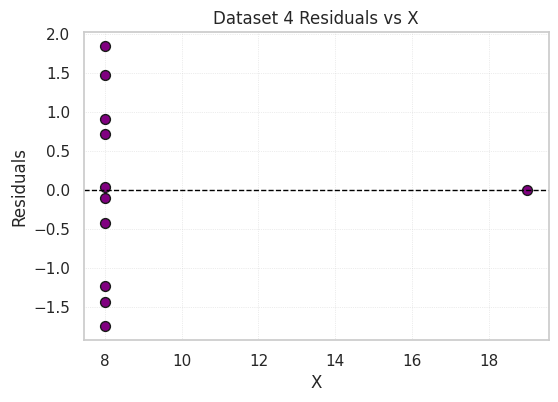
Residual plots show the difference between the observed Y values and those predicted by the regression line.
# -------------------------------
# 6️⃣ Residual plots
# -------------------------------
for dataset_name, group in df.groupby('dataset'):
    x = group['x']
    y = group['y']
    slope, intercept, _, _, _ = stats.linregress(x, y)
    y_pred = slope*x + intercept
    resid = y - y_pred

    plt.figure(figsize=(6,4))
    plt.scatter(x, resid, color='purple', s=50, edgecolor='k')
    plt.axhline(0, color='black', linestyle='--', linewidth=1)
    plt.title(f"{dataset_name} Residuals vs X")
    plt.xlabel("X")
    plt.ylabel("Residuals")
    plt.grid(True, linestyle=':', linewidth=0.5, alpha=0.7)
    plt.show()
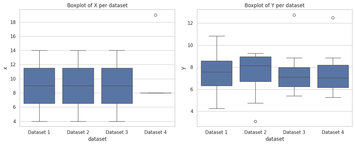
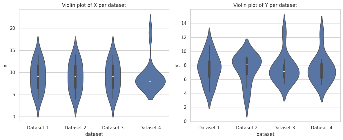
Boxplots and violin plots of X and Y values per dataset show differences in spread and identify outliers.
# -------------------------------
# 7️⃣ Boxplots and violin plots
# -------------------------------
plt.figure(figsize=(12,5))
plt.subplot(1,2,1)
sns.boxplot(x='dataset', y='x', data=df)
plt.title("Boxplot of X per dataset")

plt.subplot(1,2,2)
sns.boxplot(x='dataset', y='y', data=df)
plt.title("Boxplot of Y per dataset")
plt.tight_layout()
plt.show()

plt.figure(figsize=(12,5))
plt.subplot(1,2,1)
sns.violinplot(x='dataset', y='x', data=df)
plt.title("Violin plot of X per dataset")

plt.subplot(1,2,2)
sns.violinplot(x='dataset', y='y', data=df)
plt.title("Violin plot of Y per dataset")
plt.tight_layout()
plt.show()
This combined plot displays all four datasets side by side for comparison. It highlights how similar summary statistics can correspond to very different distributions.
#-------------------------------
# 8️⃣ Faceted comparison (scatter + regression)
# -------------------------------
sns.lmplot(data=df, x='x', y='y', col='dataset', col_wrap=2,
           height=4, aspect=1, scatter_kws={'s':50}, line_kws={'ls':'--'})
plt.subplots_adjust(top=0.9)
plt.suptitle("Anscombe's Quartet - Faceted Scatterplots with Regression Lines", fontsize=16)
plt.show()

Interactive scatter plots allow zooming, hovering, and dataset selection.
import plotly.express as px

# Interactive scatter plot with facets per dataset
fig = px.scatter(
    df,  # long-format dataframe
    x='x',
    y='y',
    color='dataset',
    facet_col='dataset',  # creates one plot per dataset
    title="Interactive Anscombe Scatter Plots",
    labels={'x': 'X', 'y': 'Y', 'dataset': 'Dataset'},
    height=600,
    width=900
)

fig.update_traces(marker=dict(size=10, line=dict(width=1, color='DarkSlateGrey')))
fig.update_layout(title_x=0.5)  # center title

# Show in notebook
fig.show()

# Optional: save as HTML to include in GitHub/portfolio
fig.write_html("output/anscombe_plotly.html")
Despite nearly identical summary statistics, the four datasets show very different behaviors when visualized. This demonstrates why EDA should combine numeric summaries and visual inspection.
Future directions / ideas: